Botanical Bodies 4 – In the Forest

That feeling in the forest, when you sense a rhythm and knowing larger and wiser than your little anxious brain. The ferns, trees, fungi and mosses are running on ancient time and knowing, that breathes so slowly, inhaling our our exhales into the earth. In the forest, I feel like my body can remember that it is not the silly thinking of groups of people trying to sell things and prove things that are in charge. It is thoughts so old and expansive I don’t even know the words. In the forest, my body can remember how to be cared for.

This is my fourth illustration considering the body as an organism in ‘Botanical Bodies.’ Also a moment to consider that all bodies deserve access to nature without judgement, and that our current sizeist culture is a barrier to this. Many folks in large bodies cannot access equipment or sizes they need to take part in nature based activities, and / or are treated negatively when occupying these spaces. All people, in all bodies, should feel welcomed in nature spaces without a lens of healthism or fitness imposed upon them.

Why working on This is a Job For Mommy! felt good

This is A Job For Mommy! An A-Z Adventure is coming out this week (and for sale!), and I am sitting with how good it feels to have created artwork for a project whose message I believe in so fully. In Keegan Connor Tracy’s book, “Mommy” has had 26 careers (one for every letter of the alphabet) and shares her experiences with her daughter in rhyming verse.

With a focus on jobs that are not traditionally considered “feminine” occupations, Keegan encourages readers to consider that women and girls can do any work – from the messy and physically demanding to the silly, scientific and adventurous.

Having supported diverse learners in school settings for the past nine years, this really resonates with me. Though we are comfortable with encouraging girls to strive academically, when academics are not a female student’s strength, girls are not encouraged to pursue the trades and manual, necessary community work (like electricians, mechanics, landscapers, etc.) in the same way as boys. Elective shop classes, for example, are often made up of predominantly male students.

In my experience, girls tend to see themselves occupying roles related to the beauty or fashion industry much more readily, or in caring or serving professions where women are currently heavily represented.

window washer

This is one of the reasons W is one of my favourite jobs of Mommy. For W, Mommy is a window washer! This is the type of job, like many roles relating to building maintenance and construction, that I think many girls would not envision themselves in. Maybe window washing is not usually considered glamorous, but it’s important, and pays what would generally be considered a living wage.

The ability to choose work that supports us is central to financial autonomy, which is essential to being able to make choices for ourselves, and self-determination is key to equality for girls and women.

There is so much work that is considered “men’s work” by default, not because it needs anything that men specifically have to offer, but because the historic domination by men in every field of paid work has not been eroded in that particular category. I’m thinking of how often it is easy to let the term “work men” slip off the tongue. Because most of the people we see doing everyday work in the community – like construction, automotive repair, electrical or plumbing work and other jobs that occupy the STEM fields (science, technology, engineering, mathematics), are men.

These are all good jobs, and there is no reason women could not, theoretically, be doing them. Indeed, it is projected that there will be a shortage of one million skilled trade workers by 2020, so women are actually needed to step into these roles. But preparing girls for jobs in skilled labour, manufacturing and trades has to be worked into how they view themselves at a young age, so they can even imagine themselves in the world of physically engaging, often messy “men’s work.” Employers are calling for training for girls in STEM as they recognize that it is a cultural and educational shift that needs to occur to correct the gender imbalance.

So, it feels good to contribute to something that can help shift how girls might project themselves in the future of work. Keegan chose a mix of kinds (and importantly, class) of occupations – blue collar, entrepreneurial, community service, sports, entertainment – and on the page all the jobs are elevated to something that is fun, exciting and meaningful.

I feel super lucky that I got asked to do work that I find meaningful in creating the illustrations and design for this book. I never take it for granted that it’s because I was told, as a daughter at home, and student at school, that I could.

img_7662

This is a Job For Mommy! Book Release

I’m so excited to be celebrating the release of Keegan Connor Tracy’s alphabet book, This is a Job For Mommy! An A-Z Adventure. It will take place at Chapters, Metrotown Saturday Sept. 22 from 1-3.

This was such a fun book to create artwork for, especially since I LOVE the message so much. “Mommy” has had a different job for every letter of the alphabet and shares her many work adventures with her daughter in rhyme. Readers will see that mommies, and daughters can do any job in every field.

img_7644-1

Keegan and I will both be in attendance with a reading and signing. Hope to see you there!

The Art of Belonging

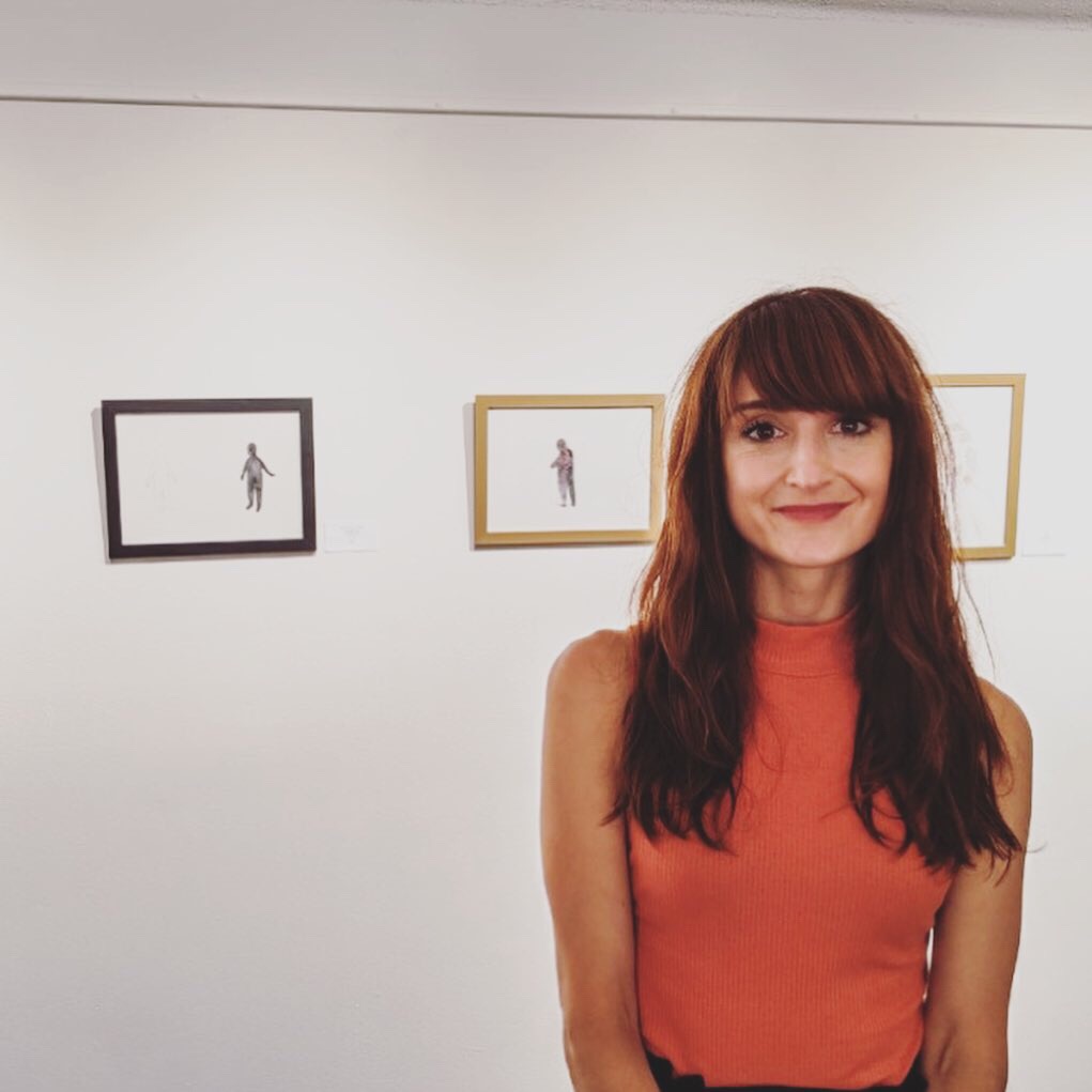
During the Winter and Spring of 2017/2018 I was fortunate to work with the students of John Oliver’s junior and senior Lifeskills classes, as well as peers from the general school community and other Learning Assistance programs, to facilitate a project entitled “The Art of Belonging.”

This ongoing project, which consisted of weekly art making sessions over nine weeks, had several key themes, developed in collaboration with Eddie Cruz, the Junior Lifeskills teacher.

Foremost, we recognized that for these students in Lifeskills classes, all of whom have intellectual disabilities (and sometimes additional physical disablities), the highschool experience presented social limitations, as well as a limited access to a fine arts curriculum. With ‘The Art of Belonging,’ we wanted to enable a creative experience and atmosphere in which students with disabilities could access relationship with students from the wider school community. It was also important that this relationship building did not centre around the relationship of “helper” and “helped” that so often inform the dynamic between students with disabilities and their and non-disabled peers. For this project, every student would occupy the role of “creator,” and a more natural peer relationship would have the opportunity to unfold.

Indeed, the role of ‘creator,’ or artist – a holder of agency and maker of choice – was a valuable one to focus on for all students involved.  Many of these students communicate in non-traditional or non-verbal ways, and their expression and actions are often mediated by the pragmatics of schedules, staff or other adults, and access to visual materials or communication tools. For this reason we (the educators) made sure to take a process-based approach – one in which the exploration and experimentation with art materials and form were encouraged over any idealized product, with an emphasis on choice making and freedom to follow interest. Instead of aiming for any particular outcome, we were hoping to find ways that students would engage as much as possible and have the opportunity for free exploration and embodied expression.

While I presented a concept of design to start off many lessons (colour, movement, pattern, etc.) students were free to investigate the concept in the way that they were moved to. It was also important to present non-traditional art making tools that could engage and be accessible to students with different sensory needs and / or fine motor abilities. We used sponges, water balloons, textured material like feathers and beads, as well as collage materials, to name a few options.

A second central theme of the project was to strengthen emotional literacy. This meant that we would focus on building vocabulary around a range of emotional experiences through art. We also heavily incorporated the “zones of regulation,” a staple in educational settings that focus on recognizing, normalizing and building skills to cope with, all emotions. We were drawn to this theme not only because emotional regulation was a focus of the Lifeskills curriculum, and highschool is generally recognized as an intense, often tumultuous emotional period in young peoples’ lives, but because emotions are something that every person experiences. Emotion was a natural meeting place for mainstream and disabled students.

So, for the first five weeks, we focused on the emotional qualities of one ‘zone’ (yellow, green, blue, red) partnered with one design concept. We talked about the emotions of the zones and how we related personally to them in large and small groups. Students were then encouraged to explore their emotions personally through art making, while listening to music curated to accompany the week’s ‘zone.’ The art created was kept in a folder, and after five weeks it was repurposed as collage material to create a self-portrait.

During all of the art making sessions, there was natural staff involvement and support for students whose independence in manipulating the art making tools was limited (due to issues involving fine motor skills, mobility or strength). In order to ensure that students were accessing as much agency as possible, support staff and myself met prior to the start of the project to talk about best practices in enabling choice and creativity for students with these limitations.

When it was time to create self portraits, participants were not only invited to use the painted and drawn materials from their own folders, but also to share some artworks to create a group set of collage materials that everyone could use. What was shared, or ripped up or cut up for collage, and what was kept whole, was left up to the artist. The resulting artworks were individual portraits composed in part of communal “emotional” materials – underlining the reality that we are all made up of different emotional components, but also that these emotional experiences are shared among all members of the class and community.

After the artwork was finished the portraits were photographed, printed in a book, and the entire school was invited to an art show in the cafeteria. It was incredibly well attended by the general student population and family members, thanks in large part to the promotional posters made by the artists leading up to the event, and artists and the larger school community had a chance to interact in a new context. Visiting students studied the artwork carefully, while each artist sat with their artwork. Candy and snacks were provided by hosts to visitors, and the artists engaged with guests according to their comfort level.

After the show the works continued to be displayed in hallway glass cases as an ongoing “gallery,” allowing the celebration and recognition of the project and artists to continue past the art show.

In the “Art of Belonging” printed book artists provided bios and statements about the project. Even when the write-ups were written in the words of support staff, it allowed readers to get to know the personalities of the participants a little bit. I’ll share some of  what was written in students’ own words:

” I like art because I get to draw or paint anything I want to. I enjoy drawing more than painting because it’s easier for me to draw. I draw at home and at school. My favourite Art Of Belonging piece was the painting of kids’ faces.”  – Charlotte, grade 8

“I like art because it allows me to imagine my own world. I enjoyed the feelings part of Art of Belonging. My favourite Art of Belonging piece was the forest drawing.” – Jocelyn, grade 9

“I like to do art every day. I love to colour super heroes like the Hulk, Spiderman and Batman. My favourite part of Art of Belonging was getting to paint my favourite characters!” – Domnic, grade 11

My favourite colours are red, yellow, orange and blue. In my free time I enjoy drawing and colouring pictures of my family, friends and favourite movie characters. I play the piano, drums and guitar. My favourite part of Art of Belonging was creating art with the students from Take A Hike program!” – Benjamin, grade 12

“I enjoy doing Art of Belonging because it’s fun. My favourite Art of Belonging job was the painting. I made one with lots of colours. I really like working with Sam.” – Lian, grade 9

One of my favourite parts of this project was seeing students who were generally very shy, quiet, or did not have the ability to communicate verbally, focus deeply on their work in serious concentration. They would end up producing something vibrant, unique and enexpected. I know that feeling so well, of having a vision you want to execute, a reality that you want to lay out on the paper in front of you. I love that we were able to create a space, and give access to the instruction and materials, that enabled students to enter that state of flow. I love that we got to see parts of their imaginations and personalities that we may not have otherwise known.

This project was conceived after I spent a fair amount of time working as a support worker in lifeskills classes. These programs often, by design, limit students’ access to inclusion with their school community. I would hope that the arts could be recognized as one way to bridge this gap between students with disabilities and their peers.

Also, I am a believer that creativity, in one form or another, is essential to well-being for everyone. Everyone should have the chance to be an artist.

art of belonging display

On behalf of the participants of “The Art of Belonging,” I would like to thank Opus Art Supplies for a generous donation of supplies, the John Oliver PAC , and acknowledge that this project was funded in large part by the Artists in the Classroom grant disbursed by ArtStarts in Schools and funded by the Province of British Columbia and the BC Arts Council.”

A new oil painting- Sea Foam

I finished this oil painting dyptic (Sea Foam, 11 x 14 each, on wood panel) a couple of days ago, and though I haven’t photographed it properly yet, I wanted to share.

Part of a series on natural flow systems, this piece illustrates in light turquoise the sea foam that roils on top of churning water. In general I’ve used my own emotional/ psychological and spiritual questions and needs to guide which natural design imagery I choose for each work in this series.

I started this piece when I was thinking about flow and connections between people that allow them to create something together (I had a project in mind that was beyond my scope and abilities alone).

I imagine we’re like the foam tumbling through the deep and unknowable current driven forces of our lives and circumstances. We can eventually find each other through a combination of will and chance for a moment to make contact. I guess through painting this I was expressing a hope for this to happen for me.

That was last summer (I seem to work on these paintings in slow time) and the connections appear to be made. Fingers crossed.

Happy pride!

I wanted to make something to celebrate my LGBTQIA+ friends and the wider community. Though this is a fun month to party and attend parades, it’s important to remember there is still work to be done to make sure people of all genders and identities are safe from fear, discrimination, and harm.

I created this piece in Corel Painter and Adobe Illustrator.

Author / Artist Visit

I recently had the good fortune of visiting Nootka Elementary School for an author visit with art workshops to follow. I was also able to include an introduction to media literacy in the presentation, which was followed by some fantastic discussion with students! It was so fun to hang out with these kids, read The Body Book, and make artwork about their favourite things to do in their bodies.

I love this activity because it shifts the emphasis on how our bodies look to how it feels to be in them, from a perspective of judgment to one of gratitude. It also culminates in a beautiful gallery of diverse bodies to decorate the class with!

Below I included some photos of the artwork in process. These images contain so much joy and imagination. I love helping kids to visualize their bodies in a positive way.

New colouring sheets!

I have created a downloadable package of colouring sheets to go with The Body Book! Click here and download away!

I would love to see what these sheets look like coloured in! So tag #thebodybookkids, or get at me on Facebook or Instagram and I’ll feature your work on The Body Book facebook page.

Facebook: Roz MacLean Art

Instagram: roz_macLean

As always, The Body Book is available to order or you can ask your local bookstore to order it.

FREE art lesson for The Body Book

I have FINALLY put together a resource to go along with ‘The Body Book,” after meaning to for a looong time. I’ve done this art lesson in classes and day cares and it is such a fun and meaningful way to help kids rethink their relationships with their bodies.

Even in kindergarten and early primary grades kids are learning to judge their bodies by how they look, and whether they “fit” the ideal image they see in media, toys and adult role models. Sadly, it’s not rare to hear a girl in grade one call herself “fat.”

I wanted to shift the focus to one of celebration and gratitude, so this activity is all about answering the question: “What is my favourite thing to do in my body?”

The results kids come up with are diverse, vibrant and fun. When these go up on the wall the classroom turns into a place where EVERY BODY is celebrated for who they are.

Here’s a link to the lesson plan  PDF. 

Dog portrait of Betty

This portrait was created for a Christmas present, which is always a special commission. In this case, Betty had passed away recently so it was extra meaningful.

It feels so intimate to provide someone with a reminder of their relationship with their animal companion when that pet is no longer with them.  It’s so deep and sad when this relationship ends. It’s a special, pure type of connection whose weight I think is often overlooked.

I used India ink to paint Betty with some white gouache for accents, and for the background used watercolour and white pen.


amy dog 3
Betty