art up the wazoo

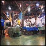
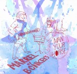
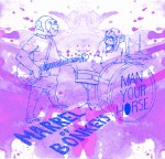
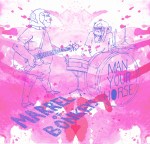
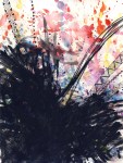
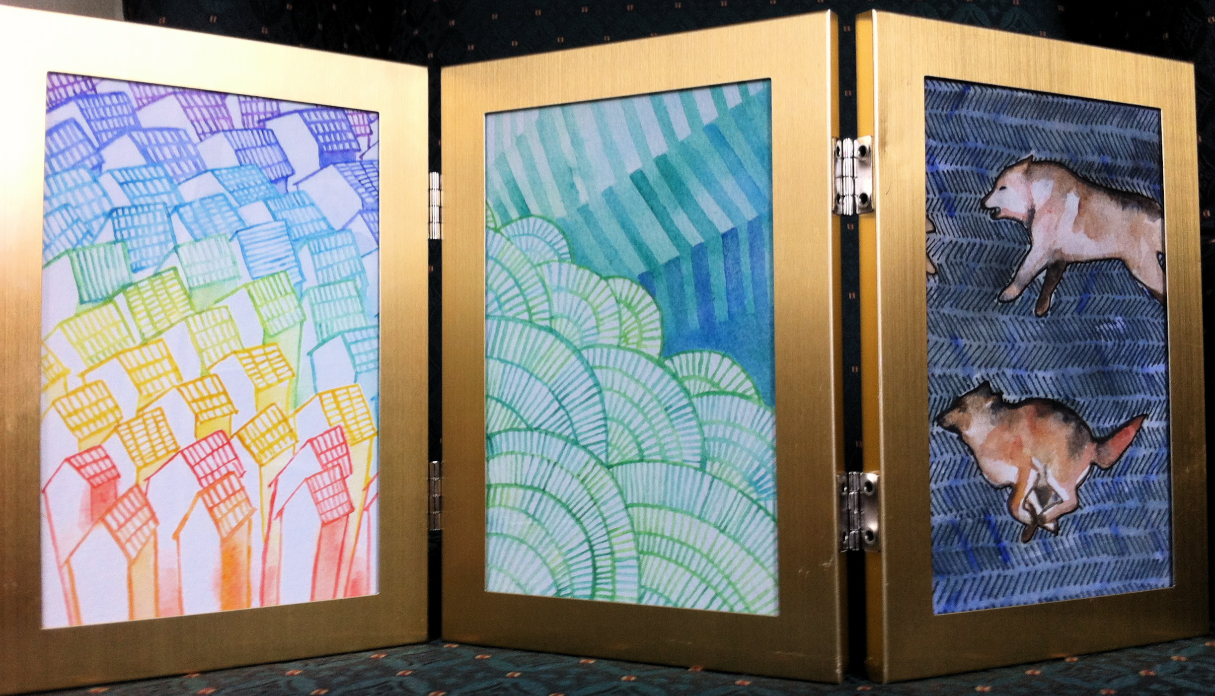
Today’s been an inspiring day. I started out at the Roundhouse Center talking with the lovely people from Papergirl Vancouver about art, then stumbled upon a comic/art convention in their gallery.  I picked up some art for my walls, and came home to work on a new project for children’s illustration.  I’m working on developing a new style of illustrating kids in watercolour.  At the moment its all a work in progress.

BTW: Papergirl is an amazing event that shares art with the unsuspecting, breaking chains of commodification in the process. CHECK THEM OUT.  Plus, join in!

The art of bookmaking

I’ve started a continuing ed class at Emily Carr all about the basics of bookmaking.  Our first assignment was a one page, one cut ‘zine, and in our second class we made a 4 punch book with Japanese calligraphy paper.  I’m pretty in love with this class, and have a feeling that once it’s over I’ll be incorporating bookmaking into my art making practice.

Monkey Town

cd cover art for Man Your Horse

This is the artwork I made for Vancouver band, Man Your Horse‘s new release “Marrel Of Bonkeys.”  Below are some other options that didn’t quite make the cut.  I was super into splatters and crazy colour combinations throughout this process.

End of the blues

This January I was lucky to be part of the “January Blues” show at the Burnaby Art Council’s Deer Lake Gallery.  The show ran from Jan 11 to Feb 3rd, and featured blue artwork from lots of artists.  Also, there was blues music at the opening, which was a great idea.


A couple more

So I’ve gone on a little hiatus after going back to work, but have finally gotten on the ball and started scanning again.  These pieces are from my summer project, which is untitled right now, but has something to do with the dualities inside of us.  More to come soon.

Inside Opposite

This is a set of illustrations I’ve been working on over the summer (with watercolors and a Micron 005 pen), though I’m not quite finished yet.  The focus of these drawings/ paintings is on the capacity we all have to contain multiple, often contradictory and opposing selves.  I think that these lights and shadows within us compete and relate to one another to compose who we are.  Partly, I’ve been inspired by Jung’s ideas about archetypes, and the idea that we all have in common certain symbols, fears and desires.

Summer Project- opposites

Here is another pair of pieces thinking about our opposites.  This set touches on the idea of alone-ness vs. being part of a shared collective history.

through a scanner darkly

I just got a new scanner, which only cost me $30 on craigslist, but I’m super excited because it actually seems to be scanning the lighter parts of watercolour pieces that were getting blown out before. Here are the first two pieces I’ve scanned in so far (the first is for a project I’ve been working on over the summer, the second is for an upcoming issue of the Capilano Courier):

new poster and art as gifts

I have just finished the poster for J’s tour kick off, which features a colour monster and some watery word balloons.  Under a serious time crunch I probably borrowed a little more inspiration than I would have liked from other show posters that I’ve seen- it feels vaguely familiar- but it was fun to make.  It was a great opportunity to play with simple shape filled with a more carefully drawn pattern.

I’ve also been using gift giving as an opportunity to play with watercolour and ideas.  I made some cards for co workers, finally giving myself a good reason to use rainbow washes in lettering.  I also made my dad’s father’s day gift out of a frame I found at the Sally Anne’s, which turned out to be the perfect fit for some water colour post cards.